
Effective Power BI dashboard design is the art of turning raw business data into clear, interactive visual stories. It's not about throwing charts on a page; it's a strategic process that combines user experience, data modelling, and clear communication to help decision-makers get answers at a glance.
Why Good Dashboard Design is a Business Game-Changer
Many South African companies invest in Power BI expecting instant insights, but end up with a dashboard that’s more confusing than helpful. This isn't a software problem; it’s a design failure. A great dashboard is a strategic tool built to answer specific business questions and guide smart actions.
Without a solid design strategy, even the best data can be misunderstood or ignored. The goal is to create a guided analytical journey for the end-user—whether that's a sales manager in Johannesburg tracking targets or an operations lead in Cape Town monitoring logistics.
When the design is right, the value is immediate:
- Faster, Smarter Decisions: Clear Key Performance Indicators (KPIs) are front and centre, giving leaders the confidence to make quick calls without digging through spreadsheets.
- Boosted Efficiency: Bottlenecks in the sales funnel or supply chain become instantly visible, allowing for quick intervention.
- A True Data-Driven Culture: When data is easy to understand, people actually use it. It becomes a trusted tool for everyone, not just analysts.
Thoughtful Power BI dashboard design ensures you get a real return on your data investment. It turns software into an indispensable business asset that drives growth and smooths out operations.
Need help building a Power BI dashboard that delivers real business value? Contact DataSimplified to discuss how we can turn your data into powerful insights.
Defining Your Dashboard's Purpose and Audience
Before opening Power BI, the most critical work is defining why you are building the dashboard. Skipping this discovery phase is the fastest way to build a report that looks impressive but delivers zero business value.
Move past vague requests like "we need a sales dashboard." Dig deeper to find a specific, actionable objective. Ask questions like, "What specific business decision will this dashboard help someone make?" or "Which three KPIs would have the biggest impact on our quarterly performance?" This clarity provides a blueprint for every design choice.
Identify Key Stakeholders and End-Users
You must distinguish between stakeholders who request the dashboard and the end-users who will interact with it daily. A director might want a high-level overview, while an operations manager needs to drill into granular details to manage their team.
To ensure the final product is useful, understand the end-user's needs:
- Sales Teams: Need to see performance against targets, lead conversion rates, and pipeline health at a glance.
- Operations Managers: Focus on efficiency metrics like production output, delivery times, or stock levels.
- Finance Departments: Require precision for monitoring cash flow, budget variance, and profitability.
This journey—from a raw data dump to a strategic tool that generates clear insights—is what it's all about.
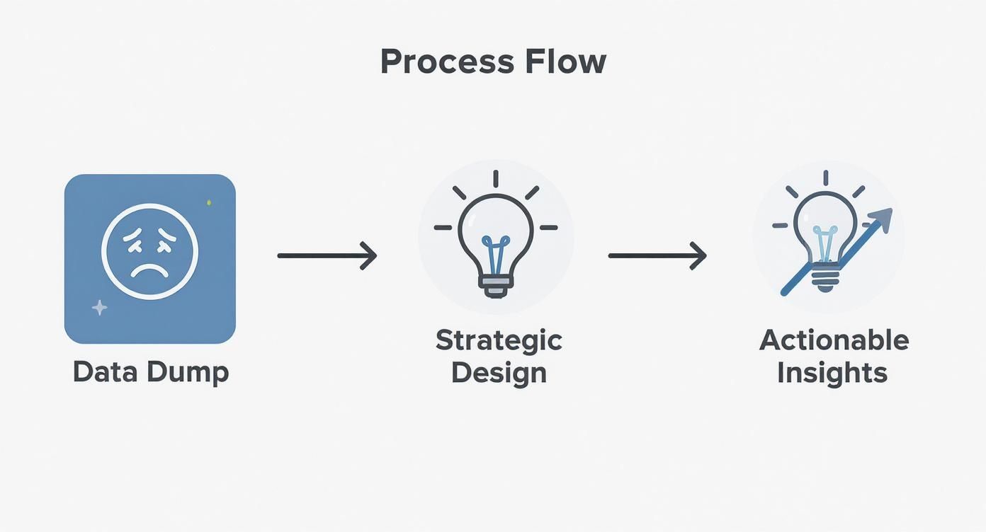
Without strategic design, data is just noise. With it, that same data becomes a catalyst for meaningful action.
Run Workshops to Define Requirements
Focused requirements workshops are the best way to uncover user needs. These are targeted sessions designed to extract specific information, often by creating simple user stories.
For example: "As a regional sales manager, I want to see my team's weekly performance against their targets so I can provide timely coaching." This simple statement clarifies the user, their need, and the desired outcome, forming a solid requirement for your Power BI dashboard design.
A dashboard without a clear purpose and a defined audience is just a collection of pretty charts. Focus on the end-user's decisions and daily workflow to build a tool that gets adopted and delivers tangible value.
In South Africa, Power BI adoption follows the global trend: user engagement is everything. Many local companies are adopting Power BI, but success depends on building dashboards that fit into existing business workflows. Research shows that over 80% of organisations have less than 50% adoption among their workforce, reinforcing the need to build indispensable tools. You can learn more about Power BI adoption stats and trends for a deeper dive.
This planning stage guarantees your dashboard will be used and valued, not just admired from afar.
Need help building your next Power BI dashboard or data automation workflow? Contact DataSimplified to discuss how we can turn your business data into powerful insights.
Building a Data Model That Actually Works
A slick-looking dashboard is useless if it’s slow, buggy, or shows the wrong numbers. The biggest cause of these problems is a poorly designed data model. This is the engine of your report, and getting it right is critical for performance and accuracy.
Think of it like building a house: you wouldn't put up walls on a shaky foundation. A clean, logical data structure makes your Power BI dashboard design work. Without it, visuals load slowly, calculations break, and users lose faith in the numbers. This foundational work makes your insights both trustworthy and fast.
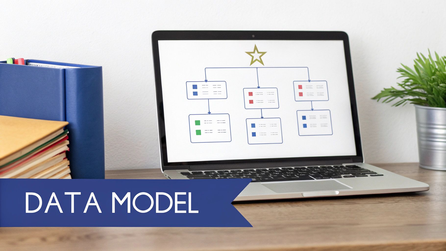
Keep It Simple: Embrace the Star Schema
For Power BI data modelling, the star schema is the most efficient structure. It organises your data into two types of tables:
- Fact Tables: Contain your numbers—sales figures, quantities sold, support tickets. These tables hold measurable business events.
- Dimension Tables: Provide context to your facts. They answer "who, what, where, and when" with data like customer names, product categories, store locations, and dates.
This model keeps relationships clean and simple, making DAX formulas easier to write and speeding up your report. A well-structured model is key to leveraging the full Microsoft Power Platform for powerful analytics.
For other modelling approaches, see our guide comparing the star schema vs snowflake schema.
Do the Hard Work in Power Query First
Before building your star schema, you must clean your data. Power Query, Power BI’s built-in data transformation tool, is where you turn raw, messy data into a clean, usable format.
Consider a South African retailer receiving daily sales files from different branches. One branch might use DD/MM/YYYY while another uses MM-DD-YY. In Power Query, you can standardise these into one consistent date format before they enter your data model.
An efficient data model is the secret to a high-performance dashboard. Every hour spent cleaning data in Power Query and structuring a star schema saves ten hours of troubleshooting slow reports later.
Essential clean-up tasks in Power Query include:
- Handling Nulls: Replace blank values in a 'Sales Amount' column with zero to prevent calculation errors.
- Splitting Columns: Split a 'Full Name' column into 'First Name' and 'Last Name' for better filtering.
- Removing Duplicates: Ensure every record is unique to avoid inflating your numbers and causing bad business decisions.
Data preparation is not glamorous, but it is the most important part of building a dashboard. It's the essential engineering that separates a frustrating report from one that drives real business value.
Data Model Best Practices vs Common Mistakes
| Best Practice | Common Mistake | Why It Matters for Your Business |
|---|---|---|
| Use a Star Schema | Merging all data into one giant, flat table. | A star schema leads to faster reports and simpler formulas, saving time and reducing frustration. |
| Clean Data in Power Query | Trying to clean data with complex DAX formulas in the report. | Pre-processing data ensures calculations are faster and the model is less prone to errors. |
| Create a Dedicated Date Table | Relying on auto date/time hierarchies created by Power BI. | A proper date table gives you full control over time-based analysis like Year-on-Year growth. |
| Hide Foreign Keys in Dimension Tables | Leaving ID columns visible to end-users. | Hiding keys declutters the field list and prevents users from incorrectly using them in visuals. |
| Optimise Column Data Types | Leaving numbers stored as text or using high-precision decimals when not needed. | Correct data types reduce model size and improve performance, leading to a snappier user experience. |
Avoiding these common pitfalls directly impacts the reliability and speed of the insights your team depends on. A well-built model is a trustworthy one.
Need help building your next Power BI dashboard or data automation workflow? Contact DataSimplified to discuss how we can turn your business data into powerful insights.
Applying Principles of Visualisation and UX Design
With a solid data model, you can now turn numbers into a compelling visual story. This is where your Power BI dashboard design shines. A great dashboard communicates complex information at a glance, guiding the user to important insights without overwhelming them.
Think like a designer. Every element on the page—every chart, colour, and space—needs a purpose. You are not just displaying data; you are crafting an intuitive experience that feels like an interactive conversation with your business.

Choosing the Right Visual for Your Data
Selecting the right visual is fundamental. The wrong chart can misrepresent information or hide the key insight. Before adding a visual, ask yourself: "What story am I trying to tell with this number?"
Here are some go-to choices for common business scenarios:
- Line Charts: Perfect for tracking trends over time, like monthly sales performance or website traffic.
- Bar/Column Charts: Ideal for comparing categories, such as sales figures across regions or ranking top-selling products.
- Card Visuals: Use these for headline KPIs. A simple, bold 'Card' showing total revenue or new customers provides an instant answer.
- Tables and Matrices: When detail is necessary, like in financial reports or operational summaries, a well-formatted table is often the clearest choice.
To sharpen your design skills, review high-quality Power BI dashboard examples. This can spark new ideas for layouts and visual combinations for your own projects.
Embracing Core User Experience Principles
The overall layout and user experience (UX) separate a good dashboard from a great one. A cluttered, illogical design will frustrate users, regardless of data accuracy.
Start with a clean canvas and consider visual hierarchy. Place the most critical information, like main KPIs, in the top-left corner, where the eye naturally lands first. Arrange visuals in a logical flow that tells a story, moving from a high-level summary to finer details.
An effective dashboard doesn't make the user think. It anticipates their questions and provides clear, interactive paths to the answers. Simplicity, consistency, and a focus on the user's journey are the cornerstones of impactful Power BI dashboard design.
Making Your Dashboard Interactive and Intuitive
Static reports are a thing of the past. Power BI's interactivity empowers users to explore data themselves. Features like slicers and filters allow a single dashboard to serve many different people and their unique questions.
For example, a sales manager can filter the report to see only their team's data, while a director maintains a company-wide view. This self-service approach is critical for user adoption.
Practical UX tips to follow:
- Use White Space: Don't cram every pixel with visuals. White space reduces cognitive load and makes the dashboard easier to read.
- Maintain Brand Consistency: Stick to your company's brand colours, but use them thoughtfully. A limited, consistent palette looks professional and draws attention where needed.
- Provide Clear Titles: Every chart, table, and slicer should have a clear, descriptive title so users know exactly what they are looking at.
When you combine the right visuals with a user-focused layout, you build a tool that helps your team make better, faster decisions.
Need help building your next Power BI dashboard or data automation workflow? Contact DataSimplified to discuss how we can turn your business data into powerful insights.
Optimising for Performance, Security, and Governance
A great dashboard must also be fast, secure, and well-governed. Expertise in Power BI dashboard design goes beyond visuals to include performance tuning, security, and governance. These elements make your reports scalable, secure, and reliable for the entire organisation.
Performance is often the first thing users notice. A slow report will be abandoned. You can achieve significant speed improvements with a few practical tweaks. Avoid cramming too many visuals onto a single page, as each one sends a query. Keep report pages focused on a specific story.
Your DAX (Data Analysis Expressions) formulas also play a huge role. Inefficient measures are notorious performance killers. Also, consider your data connection mode. For most SMEs, Import mode is the best choice for performance because the data is compressed and stored within the Power BI file, making it incredibly fast.
Securing and Governing Your Data
Once your dashboard runs smoothly, you need to secure it. Governance ensures the right people see the right data. Aligning your practices with global standards like ISO 27001 provides a solid framework for managing information security.
One of Power BI’s most powerful security features is Row-Level Security (RLS). It lets you build one report that dynamically filters data based on who is viewing it.
For example, a Gauteng sales manager sees only their team's sales figures. The national sales director logs into the same report and sees data for the entire country. RLS is an elegant way to protect sensitive information while providing relevant views for each user. We cover security in more detail in our practical guide to building a data governance framework.
In South Africa, more companies are adopting structured frameworks to get real value from Power BI. Success is measured by active user counts and report consumption. For example, a local manufacturer integrated Power BI with Azure to create governed, real-time dashboards, resulting in measurable operational improvements. This structured approach aligns technical governance with business goals and builds a mature data culture.
Need help building your next Power BI dashboard or data automation workflow? Contact DataSimplified to discuss how we can turn your business data into powerful insights.
Launching Your Dashboard and Driving User Adoption
Building a technically brilliant Power BI dashboard is only half the job. The real test of success is whether people actually use it. Getting your dashboard adopted is the final, most crucial step. A great launch is a smart, deliberate rollout, not just flipping a switch.
Pre-Launch User Acceptance Testing
Before a company-wide announcement, run a User Acceptance Testing (UAT) session with a small group of end-users. This is a reality check to ensure the dashboard solves the problems identified during discovery.
Provide a simple checklist:
- Data Validation: Do these numbers look right? Do they match other reports?
- Usability: Can you figure out the filters and slicers without explanation?
- Clarity: Does each chart tell a clear story? Can you grasp key insights at a glance?
This early feedback is invaluable for catching issues and ensuring the dashboard is genuinely useful before it goes live.
Driving Long-Term Adoption
Business intelligence tools are common in South Africa, but user adoption remains a challenge. Globally, BI tool usage is around 25%. Successful adoption often depends on self-service capabilities— 73% of leaders see it as a key driver. A lack of proper training can reduce your potential user base by 50%. You can read the full research on BI and analytics adoption for more details.
To drive adoption, run a training session on launch day. Explain the why behind the dashboard—what business questions it answers and what problems it solves. This context makes it meaningful.
Empower a few ‘Power BI Champions’ across departments. These enthusiastic users can become the go-to person for their teams, offering support and encouraging others.
Finally, establish a simple feedback channel. Your dashboard should be a living product that adapts as the business evolves. This approach builds a real data culture, not just a one-off report.
Need help launching your Power BI solution or getting your team to embrace it? Contact DataSimplified to see how we can help embed data-driven decisions into your daily workflow.
Answering Your Top Power BI Dashboard Questions
We've helped countless South African businesses get started with Power BI, and the same questions often arise. Here are answers to some of the most common challenges.
How Do I Choose the Right Visuals for My Data?
The goal is to match the visual to the insight you want to communicate. Use the "five-second rule": can someone grasp the main point in five seconds or less? If not, choose a different visual.
A quick cheat sheet:
- Trends over time? A line chart is perfect for tracking monthly sales or website traffic.
- Comparing categories? Use a bar or column chart for sales by region or performance by product.
- Showing one key number? A Card visual is brilliant for highlighting a single metric like total revenue.
What's the Biggest Mistake People Make in Dashboard Design?
The single biggest mistake is information overload. Cramming every possible metric and chart onto one screen creates visual noise and buries important insights.
Good dashboard design is about subtraction, not addition. A clean, focused layout will always have a bigger impact than a cluttered one. Stick to a few core visuals per page that tell a clear story.
How Often Should I Refresh My Power BI Data?
This depends on the speed of your business decisions. An operational dashboard for a sales team tracking daily targets may need daily refreshes. A strategic dashboard for monthly board reviews might only need a weekly refresh.
A Power BI Pro license allows up to 8 automated refreshes per day, while Premium allows 48. Align your refresh schedule with what the business actually needs.
Should I Use Import Mode or DirectQuery?
For most small and medium-sized businesses in South Africa, Import mode is the best choice. It delivers excellent performance because data is compressed and stored within the Power BI file, making interactions fast.
DirectQuery is necessary for massive datasets or when you need real-time data, but it can be slow as it queries the source database with every click.
Start with Import mode by default. Only move to DirectQuery if you have a specific and compelling reason.
Need help building your next Power BI dashboard or data automation workflow? Get in touch with DataSimplified to discuss how we can turn your business data into powerful insights.
