Finding the right power bi dashboard examples can feel like searching for a blueprint. It's not just about visuals; it's about discovering functional designs that solve real business problems for small and mid-sized businesses. A well-designed dashboard guides strategic decisions, highlights operational issues, and uncovers growth opportunities hidden in your data. The challenge is moving from inspiration to a working solution without wasting time and resources.
This article provides a curated list of practical dashboard examples you can adapt for your business. For each, we analyse its strategic purpose, key metrics, and the data engineering behind it. We also offer actionable takeaways and direct links to templates to help you get started quickly.
1. Custom BI Solutions by DataSimplified
DataSimplified offers an end-to-end business intelligence (BI) service, not just a gallery of power bi dashboard examples. We build custom solutions around your specific business needs, addressing a critical gap for many SMEs: the need for enterprise-level data insights without the cost and complexity of an in-house data team. Our approach combines polished Power BI visualisation with robust back-end data engineering, ensuring your dashboards are built on clean, reliable, and up-to-date data.
Why It Stands Out: More Than Just a Visual
Many services focus only on the front-end design. We treat the dashboard as the final step in a complete data journey. We are data architects who build the entire data pipeline required to make your analytics meaningful.
Our core strength lies in our full-stack BI capabilities:
- Data Engineering & ETL: We use tools like Microsoft SQL Server to extract, transform, and load data from disparate sources (ERPs, CRMs, spreadsheets) into a centralised, optimised data model.
- Data Automation: We engineer solutions that allow dashboards to reflect current business operations, moving beyond static monthly reports to provide timely insights.
- Custom User Experience (UX): Every dashboard is designed with specific user roles and business questions in mind. This ensures the final product is intuitive and directly answers the most important questions for your team.
A beautiful dashboard built on poor data is worthless. Our value is guaranteeing the integrity of the entire data lifecycle, from ingestion to the final visual. This ensures accuracy, security, and scalability.
Practical Applications
Our model is effective for organisations rich in data but poor in insights. Our tailored approach delivers high-impact power bi dashboard examples across various sectors in South Africa.
- For Retailers: A dashboard that integrates point-of-sale data, inventory levels, and marketing performance in real-time to optimise stock management.
- For Logistics Companies: A custom solution visualising fleet data, delivery times, and fuel usage to reduce costs and improve efficiency.
- For Financial Services: Secure dashboards that consolidate portfolio performance, market data, and client risk profiles to support faster investment decisions.
Pros and Cons
| Strengths | Considerations |
|---|---|
| End-to-End Solution: We manage the entire BI stack, from data ingestion and warehousing to the final dashboard. | Microsoft Ecosystem Focus: Primarily centred on Power BI and SQL Server, which may not fit all tech stacks. |
| SME Partner Model: We offer responsive, personalised service tailored to small and mid-sized business needs. | Initial Investment: Custom development requires a greater time and budget commitment than off-the-shelf tools. |
| Deep Data Expertise: Strong capabilities in ETL and data modelling ensure data quality. | |
| High-Impact Visuals: Dashboards are custom-designed for specific user roles and business questions. |
DataSimplified is the ideal partner for businesses that want a professional, scalable, and reliable BI solution without hiring a full-time data engineering team. We turn your complex data into a clear strategic asset.
Website: https://www.datasimplified.co.za/services-business-intelligence-power-bi-dashboards/
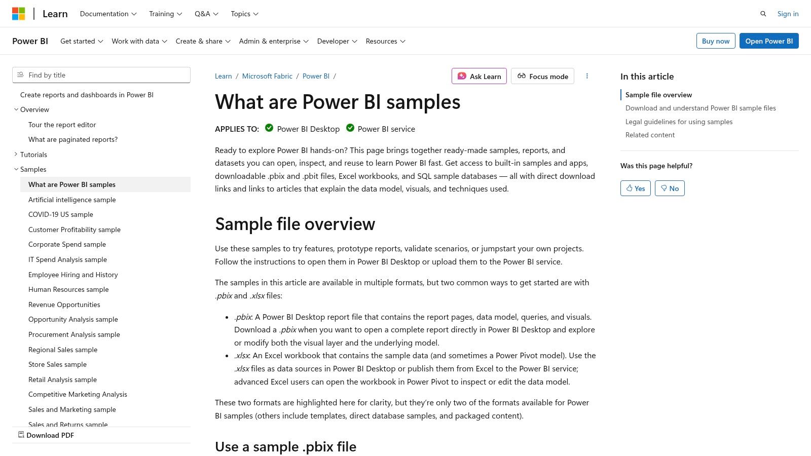
2. Microsoft Learn – Power BI Samples
For any business building its Power BI capabilities, the best place to start is the source. Microsoft Learn provides an official library of Power BI dashboard examples that are invaluable for learning and prototyping. It's a free resource for organisations to kick-start their analytics journey without any initial investment.
These samples are fully functional, downloadable Power BI files (.pbix). This allows your team to deconstruct every aspect of the report, from the data model and DAX measures to the visual layout. The collection covers common business scenarios relevant to SMEs.
Key Features
Microsoft’s samples are practical, hands-on learning kits. The direct access to the underlying files is what sets this resource apart.
- Business Purpose: The library offers dashboards tailored for specific departments, including Sales, HR, Finance, and Retail. This allows different teams to find a relevant starting point.
- Direct Access & Learning: You can download the .pbix files to explore in Power BI Desktop. This provides a safe environment to see how a professionally built report functions.
- Best Practice Demonstration: The samples showcase current Power BI features. By reverse-engineering them, your team can learn effective data modelling and modern report design.
Key Takeaway: Microsoft Learn is the definitive starting point for practical Power BI education. It allows your team to move beyond theory and engage directly with high-quality dashboards, shortening the learning curve.
Actionable Tip
To get the most value, dissect the samples. Download the "Retail Analysis Sample" and examine the data model relationships. Open the "Human Resources Sample" and analyse the DAX measures. This hands-on approach is the fastest way to build internal expertise.
Website: Microsoft Power BI Sample Datasets
Access: Free. Requires the free Power BI Desktop application.
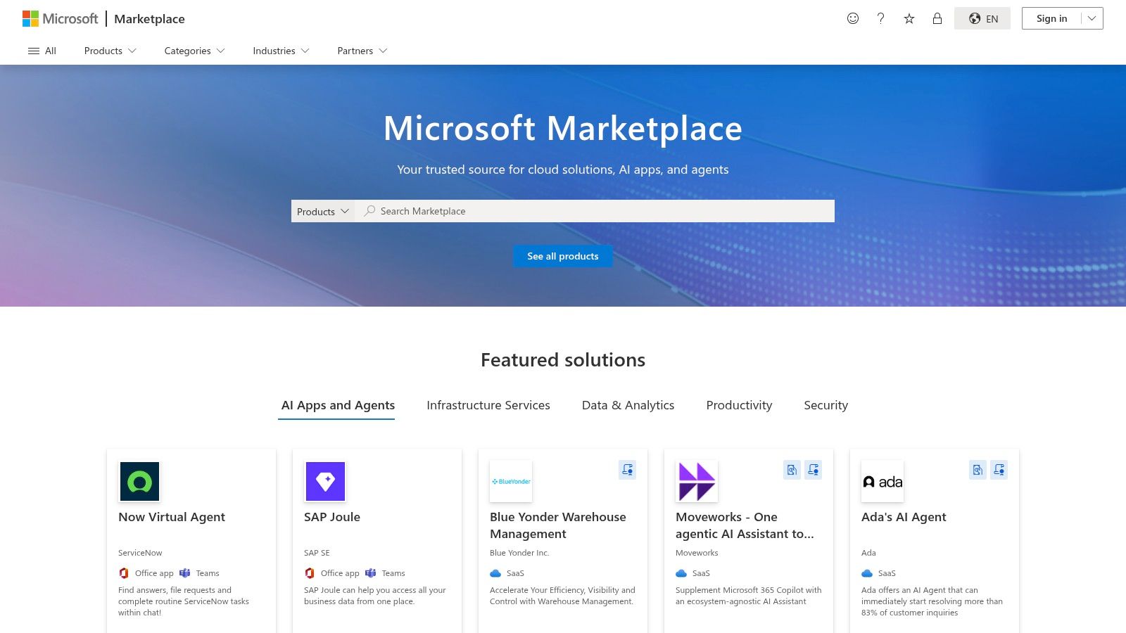
3. Microsoft AppSource – Power BI Template Apps
Microsoft AppSource is the official marketplace for production-grade Power BI dashboard examples. It hosts a library of "template apps"—pre-built packages containing reports, dashboards, and data models for specific services like Salesforce, Google Analytics, or Dynamics 365. This is ideal for connecting to common data sources with minimal development effort.
Unlike downloadable files, template apps are installed directly into your Power BI Service. They include a guided process to connect your own live data, providing an end-to-end view of a professionally developed Power BI solution.
Key Features
AppSource bridges the gap between learning and implementation. It showcases how to package and distribute analytics, offering ready-made solutions that can save hours of development.
- Business Purpose: The marketplace is organised around specific business applications (e.g., Mailchimp, QuickBooks). This allows you to find a turn-key analytics solution for the software your teams already use.
- Production-Ready: These apps are built for real-world use. They include advanced features like detailed data models and parameterised connections, offering a masterclass in building robust dashboards.
- Connect Your Data: A built-in wizard guides you through connecting your account to the template. This makes powerful business intelligence and reporting accessible to non-technical users.
Key Takeaway: Microsoft AppSource offers the fastest path from a common data source to a functional dashboard. It’s an essential resource for evaluating scalable Power BI solutions.
Actionable Tip
Explore template apps for services you already use, like "Google Analytics." Install the app and connect it to a test account. Pay attention to the authentication process and how data refresh is configured, a critical component of an automated report.
Website: Microsoft AppSource
Access: Free to browse. Installing apps requires a Power BI Pro or Premium licence. Some third-party apps may be paid.
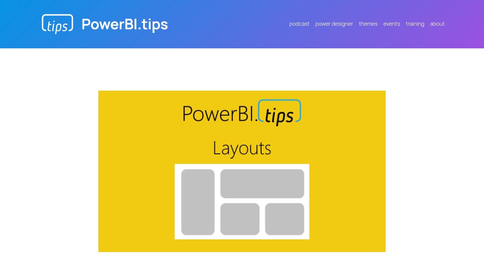
4. PowerBI.Tips – Layouts and Themes
While data modelling is the engine of a report, the user interface (UI) determines its impact. PowerBI.Tips is a community hub specialising in the visual aspect, offering a collection of power bi dashboard examples focused on design. It provides layouts, templates, and themes to help create professional reports without a dedicated designer.
This resource is perfect for businesses that want to elevate their dashboard aesthetics quickly. Instead of building every report's structure from scratch, your team can leverage pre-built design assets. This accelerates development and ensures a consistent, modern look.
Key Features
PowerBI.Tips bridges the gap between functional reporting and exceptional design. The resources are foundational design elements that make great reports possible.
- Business Purpose: The goal is to improve dashboard usability. The layouts provide structured templates for navigation, headers, and visual placement, making insights easier for users to consume.
- Reusable Assets: You can download template files (.pbit) containing the report layout, colour themes, and background images. Your team connects their data model to this pre-designed shell.
- Design Tools: The site offers tools like a theme generator for deep customisation of colour palettes, ensuring reports match your organisation's branding.
Key Takeaway: PowerBI.Tips is an indispensable resource for producing visually compelling dashboards. It empowers your team to focus on the data, knowing the design is built on a solid foundation.
Actionable Tip
Use the layouts as a starting point for a standardised internal template. Download a free layout, use the theme generator to apply your company colours, and save it as your official master file. This ensures every new report maintains a consistent, professional look.
Website: PowerBI.Tips Layouts
Access: A mix of free and paid resources. Free layouts are fully functional.
5. Enterprise DNA – Power BI Showcase
Enterprise DNA offers an extensive platform for professionals aiming to master Power BI. Their Power BI dashboard examples are part of a broader ecosystem of training, resources, and community. The Showcase section serves as an inspiration gallery and a deep learning resource, demonstrating what's possible with advanced techniques.
The platform focuses on end-to-end solutions. Many examples are connected to tutorials, datasets, and downloadable .pbix files for members. This allows your team to not only see the final product but to completely reverse-engineer the data model, DAX formulas, and design choices.
Key Features
Enterprise DNA’s showcase is more of a structured learning library than a simple gallery, connecting inspiration with practical application.
- Business Purpose: The showcase is organised by industry and function, with reports for Financial Services, Supply Chain, HR, and Project Management. This allows users to find highly specific examples.
- Deep Learning: For members, the ability to download .pbix files is key. This provides access to the "source code" of a report, enabling a deep dive into advanced data modelling and complex DAX.
- Community Content: Many examples come from the "Enterprise DNA Challenge," a community initiative where developers solve a specific business problem, showcasing multiple creative approaches.
Key Takeaway: Enterprise DNA is the go-to resource for teams looking to elevate their Power BI skills. The combination of high-quality examples and downloadable files provides a powerful framework for continuous improvement.
Actionable Tip
Use Enterprise DNA as a project accelerator. Before starting a new procurement dashboard, browse their Supply Chain examples for ideas on KPIs and layouts. If you’re a member, download a relevant .pbix file to use as a template, saving development time.
Website: Enterprise DNA Power BI Showcase
Access: Viewing the showcase is free. Downloading files requires a paid membership.
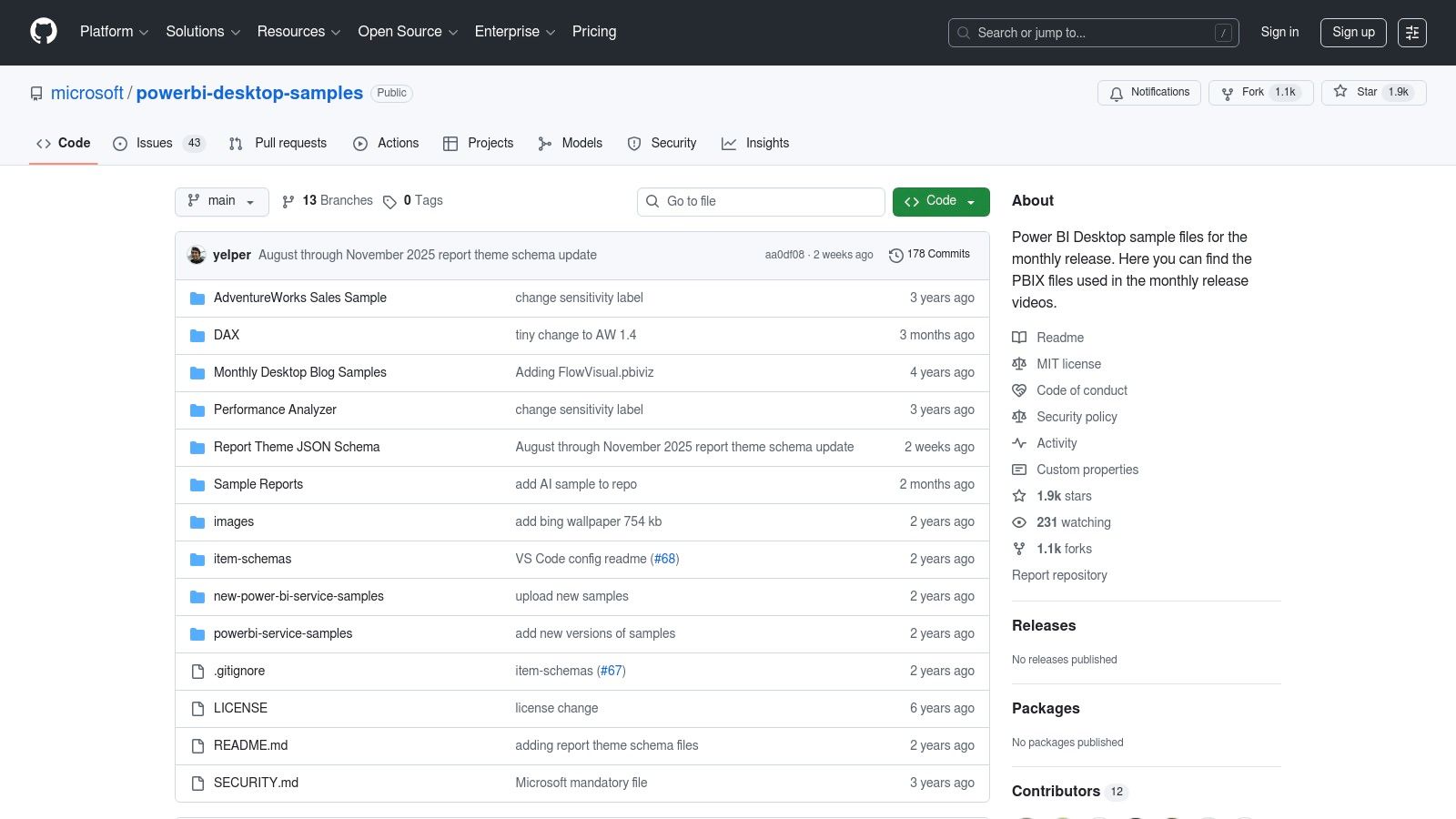
6. GitHub – Microsoft Power BI Sample Repositories
For more technical teams, Microsoft’s official GitHub repositories are an unmatched resource. These repositories contain a wealth of power bi dashboard examples, often showcasing the latest features from Power BI's monthly updates. Unlike polished galleries, these are the raw .pbix files used by Microsoft's own engineering teams.
This direct access provides a granular look at how new functionalities are implemented, making it essential for developers working with embedding, APIs, or advanced data modelling. For businesses looking to integrate Power BI deeply into custom applications, these samples provide the foundational code needed to accelerate development.
Key Features
GitHub offers a developer-first approach to Power BI, focusing on the underlying files and code rather than just the visual output.
- Business Purpose: The repositories solve specific technical challenges. The
powerbi-desktop-samplesrepo provides files demonstrating new features, while others contain examples for embedding and APIs. - Direct Access & Learning: You can download the exact .pbix file to reverse-engineer complex DAX, Power Query transformations, or data model setups.
- Best Practice: These samples serve as the official reference for implementing advanced features. They provide a reliable, Microsoft-approved blueprint.
Key Takeaway: GitHub is the ultimate resource for technical deep dives. It moves beyond standard reports to provide the code-level examples needed for custom development and mastering Power BI's advanced capabilities.
Actionable Tip
Clone the powerbi-desktop-samples repository. When a new Power BI Desktop feature is released, you can pull the latest updates and immediately explore the corresponding .pbix file. This keeps your team current with the latest capabilities.
Website: Microsoft Power BI Desktop Samples
Access: Free. Requires Power BI Desktop to open the files.
7. Etsy – Power BI Dashboard Templates
For a quick, low-cost entry point into custom visuals, Etsy has emerged as a vibrant marketplace for Power BI dashboard examples. It provides a variety of pre-built dashboard templates from individual designers and small data firms. This approach offers an affordable way for businesses to acquire visually compelling templates that can be adapted to their own data.
Etsy's offerings are commercial products sold as digital downloads, typically as .pbit (template) or .pbix files. This gives your team immediate access to a complete package. The variety of design styles makes it a valuable resource for finding a design that aligns with your company's brand.
Key Features
Etsy acts as a decentralised repository of design ideas. The direct purchase model provides a fast track to a usable asset.
- Business Purpose: Templates on Etsy cater to common business needs, with a focus on use cases like Sales, eCommerce, project management, and HR metrics.
- Direct Access: Getting the source file is key. You can dissect the data model, examine the DAX logic, and see how different visualisations are configured.
- Variety and Affordability: The marketplace model encourages competition, resulting in affordable prices and a vast selection of visual styles.
Key Takeaway: Etsy provides an accessible, low-cost marketplace for acquiring professionally designed Power BI templates. It's an excellent resource for SMEs that need a polished dashboard quickly.
Actionable Tip
Quality on Etsy can vary, so do your research. Check seller ratings, read reviews, and examine all screenshots. Look for listings that offer a .pbit file, as this makes it easier to connect your data. Use the template as a foundation: replace sample data, adapt the colour scheme, and tweak the measures to fit your business logic.
Website: Etsy – Power BI Dashboard Templates
Access: Paid. Each template is a one-time purchase.
A Quick Comparison of Power BI Dashboard Examples
| Solution | Best For | Implementation Effort | Key Advantage |
|---|---|---|---|
| DataSimplified | Businesses needing a complete, reliable BI solution | High (Full Service) | End-to-end expertise from data engineering to dashboard design |
| Microsoft Learn | Learning and prototyping | Low | Free, official samples directly from Microsoft |
| Microsoft AppSource | Connecting to popular services like Salesforce | Low | Production-ready apps that connect directly to your data |
| PowerBI.Tips | Improving visual design and usability | Low | Reusable layouts and themes for professional-looking reports |
| Enterprise DNA | Advanced users and deep learning | Medium | Detailed, downloadable examples for complex scenarios |
| GitHub | Developers and technical users | Medium | Code-level examples for embedding and advanced features |
| Etsy | Quick, low-cost design templates | Low | Wide variety of affordable, pre-designed dashboard layouts |
Next Steps to Improve Your Reporting
We have explored a diverse collection of power bi dashboard examples, from official Microsoft samples to bespoke solutions. The common thread is clear: the most powerful dashboards combine strategic design, solid data modelling, and a deep understanding of business goals.
A successful dashboard is a narrative tool that guides decision-making. The key is to move from simply presenting data to answering critical business questions.
Key Takeaways
To transform these examples into results for your business, focus on these principles:
- Start with 'Why': Before choosing a visual, define the business questions the dashboard must answer. Who is the audience? What decisions will they make?
- Build a Solid Data Foundation: A visually stunning dashboard is useless if the data is flawed. Robust data engineering, proper ETL processes, and a well-designed data model are non-negotiable. This foundational work ensures your insights are accurate and reliable.
- Iterate and Refine: The first version of your dashboard is rarely the final one. Use these examples as a starting point. Deploy a version, gather user feedback, and continuously refine it.
- Embrace Good Design: Effective data visualisation is a skill. Explore these 10 essential data visualization best practices to ensure your reports are intuitive and impactful.
The journey from raw data to a decision-driving dashboard requires a blend of technical skill and business acumen. The power bi dashboard examples we’ve covered provide inspiration, but the real value is unlocked when you apply these concepts to your unique business context.
Need help building your next Power BI dashboard or data automation workflow? Contact DataSimplified to discuss how we can turn your business data into powerful insights.
Contact DataSimplified today.