
For many South African SMEs, tracking marketing performance feels like navigating a maze blindfolded. You have spreadsheets and platform-specific reports, but you can't confidently draw a straight line from marketing spend to revenue. This guide provides a clear path to building a system that does.
Why Most Marketing Tracking Falls Short
Effective marketing isn't about launching campaigns and hoping for the best; it's about knowing the precise impact of your efforts. Yet, countless small and mid-sized businesses struggle to get a clear picture of what’s truly working.
The biggest culprit? Data fragmentation. Your customer data is scattered across separate systems that don't talk to each other.

This separation makes it almost impossible to answer fundamental questions. Which Facebook campaign generated the most qualified leads in your CRM? What's your true customer acquisition cost when you factor in every touchpoint?
The Problem of Disconnected Systems
Without a unified view, teams chase incomplete or misleading "vanity metrics." A campaign might get thousands of likes, but if those likes don't translate into sales, they are a distraction. Overlooking key signals can also be damaging; the cost of ignoring social media monitoring shows how quickly things can go wrong.
Common traps for SMEs include:
- Manual Reporting: Team members waste hours exporting CSVs and pasting them into spreadsheets. This process is slow, prone to human error, and unsustainable.
- Lack of Attribution: When you can't connect the dots, you're guessing. It becomes a struggle to decide which channels deserve more budget and which are burning cash.
- Delayed Insights: By the time manual reports are ready, the window of opportunity to act on the data has closed.
The goal is to move beyond surface-level metrics and gain the clarity needed to make confident, data-driven decisions. This requires a shift from simply collecting data to engineering it into a strategic asset.
This guide walks through building a unified system using proven data engineering principles, automated ETL pipelines, and insightful Power BI dashboards. It is an actionable path to creating a single source of truth for all your marketing efforts.
Need help building your next Power BI dashboard or data automation workflow? Contact DataSimplified to discuss how we can turn your business data into powerful insights.
Crafting Your Measurement Framework
Before building dashboards or data pipelines, you need a plan. Solid marketing performance tracking starts with a clear strategy, not tools. The most critical step is to define what success looks like for your business by translating high-level goals into measurable outcomes.
Skip this step, and you'll end up with data that tells you nothing useful. It’s easy to track metrics that feel important, like social media likes, but have no connection to your company's financial health. A proper measurement framework ensures every metric you track ties directly back to your bottom line.
Linking KPIs to Your Business Goals
At the heart of any good framework are your Key Performance Indicators (KPIs). For a South African SME, copying generic metrics from a global marketing blog is ineffective. Your KPIs must reflect your specific market, business model, and strategic goals.
This means moving past vanity metrics to focus on what genuinely drives growth. Whether your main objective is generating B2B leads, boosting e-commerce sales, or improving customer retention, each goal needs its own set of KPIs.
For example, an online retailer in Gauteng might focus on Cost Per Acquisition (CPA), breaking it down by province to see if ad spend is more efficient in the Western Cape versus KwaZulu-Natal. A B2B service company would be more interested in the Lead-to-Customer Rate, using it to determine if leads from LinkedIn convert better than those from Google Ads.
A well-designed framework is your compass. It ensures every marketing decision—from daily ad tweaks to quarterly budget reviews—is guided by data that points towards business growth, not just activity.
To help you get started, here's a table of essential KPIs we often recommend for South African SMEs.
Essential Marketing KPIs for South African SMEs
| KPI (Key Performance Indicator) | What It Measures | Why It Matters for Your Business |
|---|---|---|
| Customer Acquisition Cost (CAC) | The total cost to acquire a new paying customer. | This tells you if your marketing spend is sustainable. If your CAC is higher than your customer lifetime value, you have a problem. |
| Customer Lifetime Value (CLV) | The total revenue you can expect from a single customer account. | CLV helps you make smarter decisions about how much to invest in acquisition and retention efforts. |
| Return on Ad Spend (ROAS) | The amount of revenue generated for every rand spent on advertising. | This is a crucial, bottom-line metric that shows the direct profitability of your advertising campaigns. |
| Lead-to-Customer Rate | The percentage of leads that convert into paying customers. | This KPI measures the quality of your leads and the effectiveness of your sales process. |
| Conversion Rate by Channel | The percentage of visitors who complete a desired action, broken down by source. | It helps you identify which marketing channels (e.g., organic search, social media, email) are most effective at driving results. |
This isn't an exhaustive list, but it's a solid starting point for focusing on metrics that matter.
Building a Practical KPI Hierarchy
A KPI hierarchy helps keep everything organised. This structure maps your metrics from high-level business outcomes down to individual campaign activities, bringing clarity to everyone from the business owner to the marketing specialist.
Here’s how it typically breaks down:
- Business Goal (The Big Picture): Your ultimate objective, like "Increase company revenue by 20%."
- Marketing Objective (The 'How'): Marketing's direct contribution, such as "Generate 150 sales-qualified leads per month."
- Channel KPIs (The Day-to-Day): The metrics you watch constantly to ensure you’re on track, like Click-Through Rate (CTR), landing page Conversion Rate, and Cost Per Lead (CPL).
This tiered system connects the dots between a single ad click and its contribution to your overall revenue. It transforms your marketing department from a cost centre into a predictable engine for growth. A solid framework provides clarity, a cornerstone of effective business intelligence and reporting.
By establishing this framework first, you’re setting yourself up for success. Every piece of data you collect and every dashboard you build will be designed to answer your most important business questions.
Need help building your next Power BI dashboard or data automation workflow? Contact DataSimplified to discuss how we can turn your business data into powerful insights.
Automating Your Data Collection Pipelines
With your measurement framework sorted, the next step is getting all your data into one place reliably. If you’re still manually exporting CSVs from multiple platforms, you know the process is slow, error-prone, and time-consuming.
The only sustainable solution is to build automated data pipelines that do the heavy lifting for you.
This process starts with proper instrumentation on your marketing channels—think of it as laying a solid foundation. Your website pixels must fire correctly, and your UTM parameters must be used consistently across every campaign.
UTM (Urchin Tracking Module) parameters are simple tags added to the end of a URL. When someone clicks that link, the tags are sent to your analytics platform, showing you exactly which ad, newsletter, or search term brought them to your site. It’s simple but incredibly powerful.
The Power of Automated ETL
Once your tracking is solid, you can achieve serious efficiency with automated ETL (Extract, Transform, Load) pipelines. While it sounds like a complex data engineering term, the concept is straightforward and essential for building a trustworthy marketing tracking system.
An ETL process works as follows:
- Extract: It automatically pulls raw data from all your sources, such as the APIs of Google Ads, Facebook, your CRM like Salesforce, or even a Google Sheet.
- Transform: The pipeline cleans, standardises, and reshapes messy data into a consistent format. This can involve anything from standardising date formats to categorising campaign names based on internal rules.
- Load: Finally, it delivers the clean data into a central data warehouse where it can be analysed.
This automated flow eliminates the drudgery of manual data entry and reduces the risk of human error. Your team gets fresh, reliable data, allowing them to focus on finding insights, not wrestling with spreadsheets. For a deeper dive, our guide on performance data integration explains how to connect these systems effectively.
Instrumenting Your Key Marketing Channels
To make this practical, let's consider how to instrument marketing channels for a typical South African SME. The goal is to capture every touchpoint a potential customer has with your brand.
Imagine a local e-commerce business selling handmade leather goods. They need to follow a customer's journey from a Facebook ad to the final purchase on their Shopify store. This requires connecting your goals to your actions—the foundation of a smart data collection strategy.
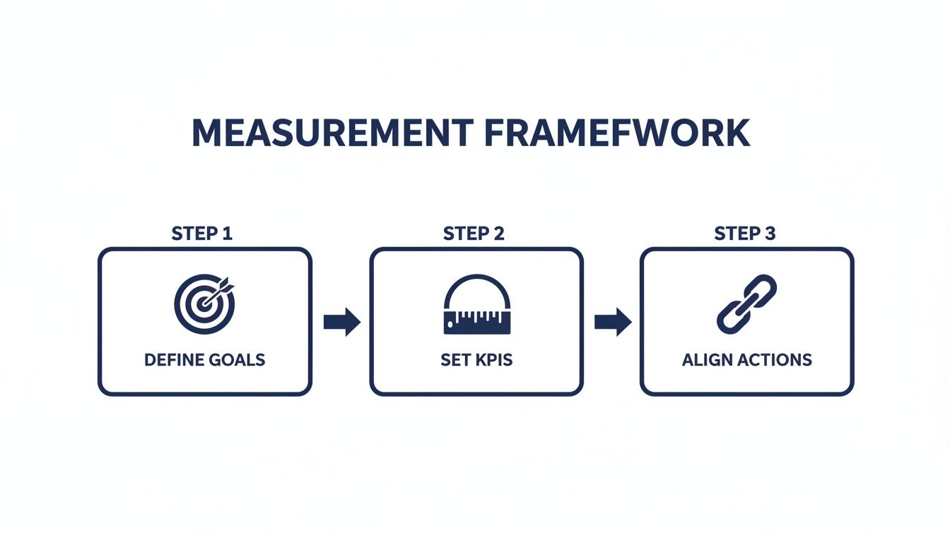
You must define your goals and KPIs before you start tracking to ensure every bit of data collected has a purpose.
Here’s a breakdown of essential tracking:
- Website Analytics: Install the Google Analytics 4 (GA4) tag on every page of your website and configure key conversion events like
add_to_cart,begin_checkout, andpurchase. - Social Media Ads: Place the Meta Pixel (for Facebook and Instagram) and the LinkedIn Insight Tag on your site. These pixels are crucial for tracking conversions and linking social media spend directly to sales.
- CRM System: Your Customer Relationship Management (CRM) system holds valuable data on lead quality and customer lifetime value. Integrating it allows you to see which campaigns bring in leads that become profitable, long-term customers.
By building a robust data collection engine, you're creating the bedrock of your entire business intelligence system. The quality of your insights is directly tied to the quality of the data you feed into it.
This is where data engineering and marketing operations meet. It’s not just about collecting data; it's about designing a scalable, accurate, and automated system. Get this right, and your Power BI dashboards will always be powered by trustworthy data.
Unifying Data to Understand the Customer Journey
Your data pipelines are feeding you clean, reliable information. The next question is: which marketing efforts convinced a customer to buy?
Answering this is the point of the entire exercise. Without connecting activities to revenue, you're just guessing where to spend your budget. This is where marketing attribution comes in.
Attribution is the science of giving credit to the marketing touchpoints that influence a customer's path to purchase. Was it the first Facebook ad, the Google search they clicked before converting, or the email you sent last week? Knowing this lets you put your money where it will work hardest.
Most companies unknowingly use a last-click attribution model, which gives 100% of the credit to the final touchpoint before a sale. It’s simple but dangerously misleading, as it ignores all the crucial steps that built awareness and trust along the way.
Choosing the Right Attribution Model
To get an honest look at your marketing performance, you need to explore models that reflect how your customers behave. The right one depends on your business and sales cycle length.
- First-Interaction: Gives all credit to the first touchpoint. It’s useful for identifying which channels are best at grabbing initial attention.
- Linear: Spreads credit equally across every interaction. It’s a balanced approach that acknowledges every step played a part.
- Time-Decay: Interactions closest to the sale get the most credit. This makes sense for businesses with shorter sales cycles.
Understanding attribution isn't just a theoretical exercise. It’s how you directly link marketing spend to revenue, giving you the confidence to shift your budget to channels that deliver the best return.
Moving beyond a simplistic last-click view requires a serious look at your data infrastructure. You must pull all your information into one central, unified place.
The Power of a Marketing Data Warehouse
This is where solid data engineering proves its worth. To make sophisticated attribution models work, you must break down data silos. A marketing data warehouse becomes your single source of truth for every customer interaction.
The term "data warehouse" shouldn't be intimidating. For many businesses, it can be a well-organised cloud database that pulls together information from all your key platforms:
- Ad Platforms: Click, impression, and cost data from Google Ads and Meta.
- Website Analytics: User behaviour and traffic sources from Google Analytics.
- CRM System: Details on lead quality and customer lifetime value from a tool like Salesforce or HubSpot.
By stitching these datasets together, you can trace the entire customer journey. You can see that a lead first found you on LinkedIn, returned to your site via organic search, and finally bought after clicking an email link. This 360-degree view is the cornerstone of effective business intelligence.
A report from a single platform shows how that channel performs in isolation but will never reveal how your channels work together. A unified data warehouse unlocks these deeper, more powerful insights. This centralised data is the foundation for building powerful Power BI dashboards that tell a complete story.
Need help building your next Power BI dashboard or data automation workflow? Contact DataSimplified to discuss how we can turn your business data into powerful insights.
Creating Actionable Power BI Dashboards
Raw data is just noise. Value emerges when you visualise it in a way that tells a clear story. This is where we turn clean, centralised data into dynamic, interactive Power BI dashboards that drive decisions.
The goal is not to build overly complex reports. We focus on creating intuitive tools for business leaders making strategic choices. An effective dashboard doesn't just display numbers; it crafts a narrative, highlighting performance against your most important KPIs.

This process turns abstract figures into a tool that helps your team monitor performance in real-time. It closes the gap between insight and action, empowering you to react quickly.
Designing for Decision-Makers, Not Analysts
The first rule of dashboard design is to know your audience. A dashboard for a CEO should look different from one for a social media manager. The CEO needs a high-level overview of marketing ROI, while the social media manager needs granular details on campaign engagement.
Before you design a single chart, ask these questions:
- Who is this for? Be specific about the primary user.
- What one question must it answer? Every dashboard needs a core purpose.
- What actions will they take? The design must guide the user towards a decision.
This user-centric approach makes a dashboard genuinely useful. The most effective visualisations are often the simplest. A clear bar chart showing campaign ROI or a line graph illustrating lead growth is more powerful than a cluttered visual. Our article on Power BI dashboard design offers more practical guidance.
Visualising the Entire Funnel
A great marketing dashboard provides a complete picture of the customer journey, from awareness to conversion. By connecting data from across your marketing stack, you can build visualisations that tell this whole story in one place.
Consider a dashboard for a South African online retailer. The top section might show high-level metrics like overall traffic and sales. Below, a performance breakdown by channel could instantly show that Google Ads are driving more sales than Facebook campaigns.
Further down, a lead funnel visualisation could reveal where potential customers are dropping off. A big dip between "add to cart" and "complete checkout" is an immediate, actionable insight. Your team can then investigate if there's a problem with the payment gateway or if shipping costs are too high. Modern tools can provide solutions for creating effective real-time engagement tracking dashboards.
Bringing Local Context into Focus
One of the most powerful features of a well-built business intelligence system is the ability to segment data geographically. For any South African business, this is essential. A national campaign's performance can vary dramatically between provinces.
A dashboard should be a conversation starter. It should prompt your team to ask "Why?"—why did sales spike in the Western Cape last month? Why is our cost per lead in Gauteng suddenly so high? These questions are the seeds of growth.
Tracking metrics like repeat purchase rates by location can reveal striking disparities. For instance, data might show that urban centres like Gauteng have repeat purchase rates 22% higher than more rural provinces. Visualising this on a map in Power BI helps you pinpoint retention gaps and tailor marketing strategies.
This level of detail transforms your marketing performance tracking from a simple reporting function into a strategic weapon. You can see which regions respond best to certain offers, optimise ad spend for specific localities, and make informed decisions about market expansion.
Need help building your next Power BI dashboard or data automation workflow? Contact DataSimplified to discuss how we can turn your business data into powerful insights.
Turning Insights Into a Competitive Advantage
A robust marketing performance tracking system is more than a reporting tool; it's a strategic asset. By committing to a unified data approach, you build a scalable, automated system that gives you a clear competitive edge.
This data-driven clarity allows your team to stop guessing and start refining your strategy in near real-time. You can finally answer tough questions about marketing ROI with confidence, directing your budget towards the most profitable channels.
The true value of a well-engineered tracking system isn't in the dashboards. It's in the speed and confidence of the decisions they empower you to make. It’s what turns marketing from a cost centre into a predictable growth engine.
This is a fundamental shift in how you operate. You stop reacting to last month's numbers and start proactively shaping next month's outcomes. Instead of debating which channels might be working, your team can scale proven winners and test new ideas with precision.
What you're left with is a more agile, efficient, and profitable marketing machine that can outmanoeuvre competitors who are still stuck in the dark.
Building this level of business intelligence demands a solid foundation in data engineering and smart dashboard design. Everything from automating ETL pipelines to structuring data for visualisation is crucial for turning raw numbers into clear, actionable insights.
Need help building your next Power BI dashboard or data automation workflow? Contact DataSimplified to discuss how we can turn your business data into a powerful asset.
Your Questions Answered
When getting started with marketing performance tracking, many questions arise. Here are answers to some of the most common queries we hear from South African SMEs.
What's the Single Biggest Hurdle in Marketing Tracking?
Without a doubt, the most common challenge is data silos. Your data is likely spread across Google Analytics, Facebook Ads, LinkedIn campaigns, and your CRM. None of these platforms talk to each other out of the box.
This separation makes it incredibly difficult to see the full picture. You can't calculate a true marketing ROI or an accurate customer lifetime value because the data points are disconnected. This is why building automated ETL pipelines into a central data warehouse is so crucial—it creates the single source of truth you need.
How Often Should I Actually Be Looking at My Dashboards?
This depends on the rhythm of your business. For a fast-paced e-commerce store with daily promotions, you'll want to check key metrics like Cost Per Acquisition (CPA) and conversion rates daily. This allows for quick, smart decisions about ad spend.
For B2B companies with longer sales cycles, a deep dive into your Power BI dashboards once a week or month is more practical. The data is always live, but a firm review schedule is what turns insights into action.
A good dashboard should be a conversation starter. It should make your team ask "why?" and dig into the stories hidden behind the numbers.
Can We Really Build This System Without a Dedicated Data Engineer?
A technically savvy person on your team can get a basic version running. Modern low-code platforms can manage some data integration, and Power BI is user-friendly enough for someone with an analytical mindset. For businesses just starting out, this is a great first step.
However, for a truly robust, scalable, and customised system that fits your business logic, bringing in a specialist is the most reliable way forward. An expert handles the complex data engineering, automation, and advanced dashboard design, ensuring your system is powerful and easy to maintain. This frees you to run your business, knowing your decisions are backed by solid, well-structured data.
Need help building your next Power BI dashboard or data automation workflow? Contact DataSimplified to discuss how we can turn your business data into powerful insights.
