
Partner programs can be a powerful growth engine for South African businesses, but tracking the right data is critical. Effective partner program analytics goes beyond top-line revenue. It’s about understanding what works so you can make strategic decisions based on evidence, not just gut feel.
Why Partner Program Analytics Matter
Many businesses have a partner or reseller channel with limited visibility into its performance. They know who brings in the biggest deals, but that’s only one part of the story. A proper analytics framework provides the clarity to answer the questions that drive growth.
This is where centralising partner data with business intelligence tools becomes critical. It lets you shift from reacting to problems to proactively building a better strategy.

Identifying Your True Champions
Surface-level numbers can be misleading. A partner who lands one massive deal a year looks good on paper, but what about a smaller partner who consistently provides high-quality leads that convert in half the time? True analytics reveals your most valuable partners based on a full spectrum of factors.
With the right setup, you can uncover crucial insights:
- Most Profitable Partners: Who delivers the best margins, not just the highest revenue?
- Highest Lead Conversion Rates: Which partners send prospects who are ready to buy?
- Fastest Sales Cycles: Who closes deals most efficiently?
Focusing on the behaviours behind the wins provides a blueprint for success. You can then replicate that model across your entire partner network, scaling what your best partners do naturally.
Optimising Resources and Engagement
Without solid data, you risk investing time and money into channels that don't perform. For example, your analytics might show that partners who complete a specific onboarding module have a 30% higher sales rate in their first six months. This insight allows you to make that training a standard requirement and improve performance across the board.
A data-driven approach stops the guesswork. You can confidently pull back from low-performing activities and double down on what truly moves the needle. Our expertise in data analytics and consulting helps you build this foundational view.
Defining the Metrics That Drive Partner Success
Before measuring anything, you must define what success looks like for your partner program. Focusing only on total revenue per partner is a common trap. While important, that number alone is a blunt instrument and can paint a misleading picture.
To get actionable insight, you need Key Performance Indicators (KPIs) that span the entire partner lifecycle. This provides a richer story of performance, showing what’s working and what isn’t. Think of it not as a single scoreboard, but as a series of checkpoints that track a partner's journey.
Moving Beyond Revenue to Lifecycle KPIs
A partnership is a relationship with clear stages, not a single transaction. Tying specific metrics to each stage allows for precise problem diagnosis.
Let's walk through the key stages and the metrics that matter:
- Recruitment: This is your top of the funnel. The goal is to measure how efficiently you acquire high-quality partners who have a genuine chance of succeeding.
- Onboarding & Enablement: Once a partner signs on, how quickly can you get them ready to sell? A clunky onboarding process can lead to long-term underperformance.
- Engagement & Activity: Is the partner actively using your resources? Low engagement is often an early warning sign of future performance issues.
- Performance & ROI: This covers sales figures, profitability, deal velocity, and the total return on the time and money invested in the relationship.
This table breaks down essential KPIs for each phase of your partner relationship.
Key Partner Program Metrics by Lifecycle Stage
| Lifecycle Stage | Primary Objective | Example KPIs | Business Question It Answers |
|---|---|---|---|
| Recruitment | Attract and sign high-potential partners. | Partner Acquisition Cost (PAC), Ideal Partner Profile (IPP) Hit Rate, Source of Recruitment. | "Are we spending our recruitment budget effectively to attract the right kind of partners?" |
| Onboarding & Enablement | Get new partners productive as quickly as possible. | Time to First Sale, Certification Completion Rate, Portal Login Frequency. | "How effective is our onboarding process at turning new sign-ups into active sellers?" |
| Engagement & Activity | Maintain an active, invested partner base. | Marketing Development Fund (MDF) Utilisation, Number of Submitted Leads, Training Attendance. | "Are our partners actively engaged, or are they sitting on the sidelines?" |
| Performance & ROI | Drive revenue and achieve mutual growth. | Partner-Sourced Revenue, Average Deal Size, Lead Conversion Rate, Product Mix Adoption. | "Which partners are delivering the most value, and what's our return on this partnership?" |
This framework helps build a narrative around your partner data, connecting activity to results.
Actionable Metrics for Each Partner Stage
The KPIs you choose should deliver genuine insights into the health of your partner ecosystem. For a South African SME, you might track how quickly a new reseller in Gauteng closes their first deal compared to one in the Western Cape. A significant difference could indicate a need for more localised support.
Select metrics that answer specific, critical business questions. Don’t collect data for its own sake. Every KPI should be tied to a strategic goal, whether it’s increasing market share, speeding up the sales cycle, or improving partner satisfaction.
Here are a few powerful KPIs to start with:
- Time to First Sale: A great barometer for onboarding effectiveness. A short timeframe means your training and support are hitting the mark.
- Lead Conversion Rate by Partner: This KPI separates the busy from the effective. It identifies partners who send the right leads. A partner with a 50% conversion rate is often more valuable than one with a 10% rate, even with lower lead volume.
- Partner-Sourced Revenue vs. Co-Sourced Revenue: Know where your deals originate. This metric helps attribute success correctly and rewards partners who are genuinely generating new business.
- Product Adoption Rate: For tech companies, this shows which partners are successfully selling newer or higher-margin products, indicating their investment in your entire portfolio.
By implementing these more granular metrics, you build a comprehensive view of your partner program's health. This foundation is the first step in creating an analytics strategy that drives business growth.
Creating a Single Source of Truth for Your Data
Partner data is often scattered across different systems. Sales figures are in your CRM, commission details are in spreadsheets or Xero, and lead engagement stats are in your marketing platform. This fragmentation makes it difficult to get a clear answer on partner performance.
To build a trustworthy analytics system, you must first break down these data silos and create a unified, reliable dataset—a single source of truth. This is the foundation of any meaningful insight. Without it, teams pull different numbers from different sources, leading to conflicting reports and debates about data accuracy.
Mapping Your Partner Data Sources
First, conduct a data audit to create an inventory of every system that holds a piece of the partner puzzle. For most South African SMEs, this is a mix of cloud-based tools and some on-premise systems.
Listing out your core platforms becomes the blueprint for your data engineering effort.
Common data sources include:
- Customer Relationship Management (CRM): Systems like Salesforce, HubSpot, or Zoho contain lead information, deal stages, and sales linked to partners.
- Accounting Software: Tools such as Xero, Sage, or QuickBooks hold the final numbers on invoices, payments, and revenue.
- Marketing Automation Platforms: Platforms like Mailchimp track partner engagement with campaigns and lead sources.
- Partner Relationship Management (PRM) Systems: If you use a dedicated partner portal, it contains data on onboarding, training, and resource usage.
Building Your Central Data Repository
Once you know where your data lives, the next step is to bring it all together into a central repository. For small to mid-sized businesses, this doesn't need to be an overly complex or expensive project.
The process involves setting up an ETL (Extract, Transform, Load) workflow. In simple terms, you pull data from your various sources, clean and standardise it, and then load it into one central location. To better understand this concept, read our guide on what data warehousing is and how it enables powerful business intelligence.
A single source of truth ensures your sales and finance managers are looking at the same verified numbers when discussing partner revenue. This alignment is critical for making confident, strategic decisions.
Creating this central hub can involve collaborating with data partners like Snowflake or using cloud platforms like Microsoft Azure. These technologies provide the scalable infrastructure needed for data integration.
Identifying Key Data Points Within Each System
With your map and repository planned, pinpoint the exact data fields you need from each system. Pulling only relevant data keeps your model clean and efficient.
For instance, from your CRM, you might grab:
- Partner Name: To attribute the sale.
- Opportunity Close Date: To analyse the sales cycle length.
- Deal Value: The total contract value.
- Lead Source: To track prospect origins.
From your accounting software, you’d pull:
- Invoice Number: To link payments to deals.
- Payment Date: For tracking cash flow and commissions.
- Actual Revenue Received: The invoiced amount.
This methodical groundwork turns a chaotic mess of disconnected data into a unified asset, ready for analysis in tools like Power BI.
Building Your Data Pipeline and Data Model
With your data sources identified, the next step is to build the technical backbone for your analytics. This involves creating a data pipeline to consolidate everything and a data model to structure it for analysis. Getting this right turns a jumble of exports into a source of clear, reliable insights.
The goal is to create an automated workflow that extracts data from different sources and pulls it into one central place. This process is known as ETL (Extract, Transform, Load), and it’s the engine that drives your business intelligence setup.
This diagram illustrates how data flows from separate systems into a unified view.
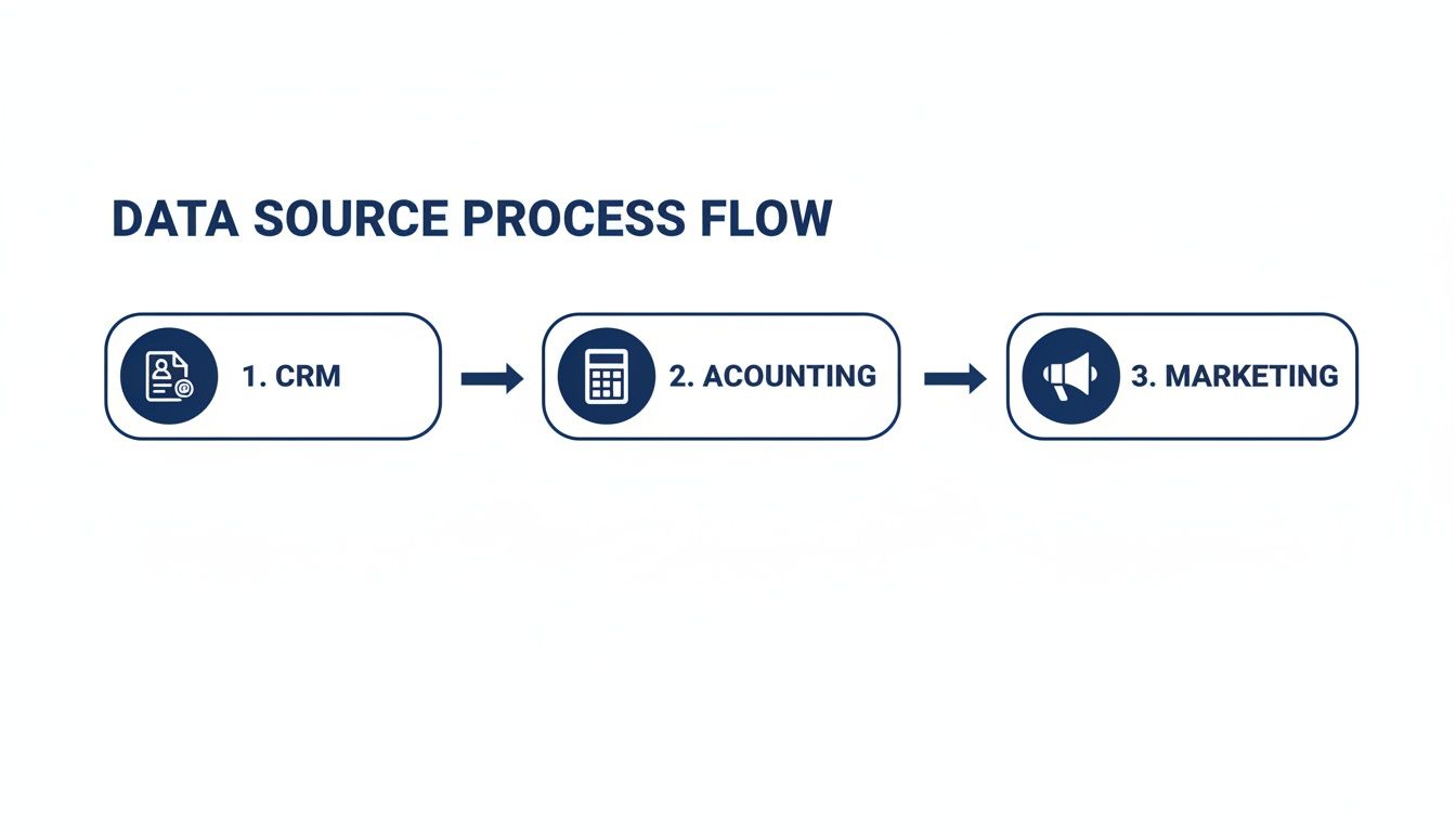
We’re consolidating isolated information from your CRM, accounting, and marketing platforms to build a single, complete picture of partner performance.
Understanding the ETL Process
ETL is the fundamental data engineering process that makes robust analytics possible. It ensures your data is clean, consistent, and correctly structured before it reaches a reporting tool like Power BI.
Let’s walk through a practical example for a South African SME:
- Extract: We pull raw data from the source, such as closed-won deals from your CRM and commission payment records from an accounting spreadsheet.
- Transform: This is where raw data is cleaned. We standardise partner names (e.g., changing "Partner ABC Pty" and "Partner ABC" to a single "Partner ABC"), convert currencies, or calculate new fields like commission percentages.
- Load: The clean, transformed data is loaded into a central data store, like a data warehouse or an Azure SQL database. This repository becomes the undisputed single source of truth.
This ETL pipeline is an automated process designed to run on a set schedule, keeping your analytics fresh without manual intervention.
Designing a Smart Data Model with a Star Schema
Once your data is in one place, you need to organise it efficiently for Power BI. The most effective structure for this is the star schema. It’s simple, powerful, and ideal for business intelligence.
A star schema splits data into two types of tables:
- Fact Table: This contains your core performance metrics—the numbers you want to measure. For a partner program, a fact table called "Partner Sales" would hold columns like
SaleAmount,CommissionPaid, andQuantitySold. - Dimension Tables: These provide the context (the who, what, where, and when) and surround the fact table. You’ll have separate dimension tables for
Partners,Products,Customers, andDates.
This model separates your numbers (facts) from their descriptive context (dimensions). This structure allows you to slice and dice your data with flexibility in Power BI, answering complex questions without needing a developer to write custom queries.
Putting Your Data Model into Practice
Building the model involves linking these tables together. Your Partner Sales fact table would include a unique ID for each partner, creating a relationship with the Partners dimension table. This connection lets Power BI instantly pull in the partner's name, tier, and location when analysing sales figures.
For instance, Microsoft partners can use data from Partner Center. Reports often include fields like MPNId, PartnerName, and Country (e.g., ZA), which form a solid foundation for a Partners dimension table. Reviewing Microsoft's insight data definitions provides detailed field breakdowns. Using these predefined fields helps ensure your partner analytics are precise and aligned with industry standards.
Investing time in a well-structured data pipeline and a clean star schema model creates a scalable foundation for your analytics strategy. This initial data engineering work is what separates a frustrating report from a dynamic Power BI dashboard that delivers strategic value.
Visualising Partner Performance with Power BI
Once your data pipelines and model are in place, the final step is to bring that data to life. Raw numbers in a database don't drive decisions until they are visualised. A tool like Microsoft’s Power BI transforms consolidated data into actionable insights.
A well-designed dashboard should do more than just show what happened; it should instantly answer your most critical business questions. The goal is to empower your partner managers to think strategically, armed with real-time performance data.

Ultimately, you are building a tool for people who are not data scientists. Your team needs to open a report, understand the situation in seconds, and know what action to take.
Choosing the Right Visuals for Your KPIs
The effectiveness of a dashboard lies in choosing the right visualisation for each metric. Different charts tell different parts of the story. Using the wrong graph can hide the very insights you are trying to find.
Here are a few practical examples:
- Ranking Partner Performance: A simple bar chart or a clean table is best for a straightforward comparison of who’s on top. It quickly ranks partners by revenue or lead conversion rates.
- Tracking Lead Conversion: A funnel chart visually maps the customer journey, clearly showing where leads drop off in the sales pipeline and helping to spot bottlenecks.
- Analysing Regional Sales: For operations across South Africa, a map visual is a game-changer. It instantly shows sales distribution by province, identifying strongholds and untapped regions.
- Monitoring Performance Over Time: The classic line chart is ideal for tracking trends like partner-sourced revenue or new leads month-on-month.
For more on this topic, see our guide on Power BI dashboard design. It provides practical principles for building functional and visually appealing dashboards.
This table matches KPIs with the most effective Power BI visuals.
Power BI Visuals for Partner KPIs
| Metric/KPI | Recommended Power BI Visual | Why It Works |
|---|---|---|
| Partner Revenue Ranking | Bar Chart / Column Chart | Provides a clear, immediate visual comparison of top and bottom performers. Simple and universally understood. |
| Lead-to-Close Funnel | Funnel Chart | Excellent for visualising drop-off rates at each stage of the sales process, highlighting pipeline bottlenecks. |
| Sales by Province/Region | Map Visual (Filled Map) | Instantly shows geographic concentrations of sales, helping to identify strong markets and areas for growth. |
| Revenue Growth Over Time | Line Chart | The best choice for tracking trends, showing performance trajectories and identifying seasonal patterns. |
| Overall Conversion Rate | Gauge or Donut Chart | Gives a quick, high-level snapshot of a single key performance indicator against a target. Great for scorecards. |
| Partner Engagement Score | Table with Data Bars | Combines detailed textual data with a simple visual element (data bars) to make comparison easier. |
Choosing the right chart is about clarity, not just aesthetics. The goal is to make the data as easy to interpret as possible.
Designing a Sample Partner Analytics Dashboard
A great partner dashboard is organised into a few key report pages, each designed to answer a specific set of questions. This approach keeps information clean and prevents user overload.
The most impactful dashboards are designed with a clear narrative. They guide the user from a high-level overview down to granular details, allowing them to explore the 'why' behind the numbers.
Here’s a blueprint for a comprehensive partner program dashboard:
1. Partner Performance Scorecard
This is your command centre, providing a high-level overview of the program's health.
- Total Partner-Sourced Revenue (YTD): A large card visual showing the headline number.
- Top 5 Partners by Revenue: A simple ranked bar chart.
- Lead Conversion Rate (Overall): A gauge or donut chart showing the aggregate conversion percentage.
- Average Sales Cycle (Days): A card visual to monitor deal velocity.
2. Sales Pipeline by Partner
This report drills down into the current sales pipeline, with filters to slice data by individual partners.
- Pipeline Stage Funnel: A funnel chart showing the number and value of deals at each stage.
- Open Deals by Partner: A detailed table listing all open opportunities, their estimated value, and the expected close date.
3. Partner Engagement and Enablement
This section connects partner activity with performance, answering questions like, "Are our most active partners also our top performers?"
- Training Modules Completed: A chart showing which partners have completed key training.
- Marketing Fund Utilisation: A visual that tracks how effectively partners are using co-marketing funds.
Understanding how AI transforms finance teams through automated reporting can also offer ideas for ensuring your data flows seamlessly for sharp financial insights. By building these targeted reports, you give your team the tools to understand and improve performance.
Putting Partner Analytics into Action
A dashboard is only useful when it is integrated into your business operations. The final step is to move from simply looking at data to acting on it. This is where the effort invested in data engineering and Power BI dashboards delivers a return.
Turning data into a strategic advantage requires a plan to embed analytics into how you manage and grow your partnerships.
Make Analytics Part of Your Rhythm
Set a regular schedule for performance reviews to transform your data from a static report into a living part of your routine.
- Weekly Check-ins: Quick, informal discussions where partner managers use the dashboard to address immediate issues. A simple question like, "I noticed your lead conversion rate dipped last week, what's happening?" can make a difference.
- Monthly Performance Reviews: A more formal look at progress against KPIs to spot emerging trends and make tactical adjustments.
- Quarterly Business Reviews (QBRs): Strategic meetings with key partners. Use the dashboard to review the previous quarter, celebrate wins, analyse misses, and set data-backed goals for the next one.
The aim is to build a continuous feedback loop. The dashboard flags an issue, your team discusses it with the partner, you implement a solution, and you watch the dashboard to see the result. This cycle drives improvement.
Securing Your Data with Governance
Trust is crucial when sharing performance data. A partner must never see another partner's sensitive information. Data governance, especially within Power BI, is non-negotiable.
Row-Level Security (RLS) is an intelligent filter that ensures users only see the data they are authorised to view. When a partner logs into their dashboard, RLS automatically filters every chart and table to show only their results. This allows you to maintain one master dashboard while providing each partner with a secure, personalised view.
Cultivating a Data-First Culture
A successful partner analytics program is about people and culture, not just technology. Even the public sector is making this shift. For instance, Statistics South Africa's official publication outlines a national strategy to build data ecosystems through new partnerships between state and private organisations.
For your own organisation, train your team not just to read a chart but to question it. Encourage curiosity and the use of insights to build more collaborative and profitable relationships. When your analytics platform becomes a central part of how you run your business, you will drive measurable growth and build a lasting competitive edge.
Need help building your next Power BI dashboard or data automation workflow?
Contact DataSimplified to discuss how we can turn your business data into powerful insights.
