
Running a business without a clear view of performance is like flying a plane with hundreds of scattered dials. You have all the information, but seeing the big picture is impossible. Power BI dashboards fix this by acting as your business's central cockpit, giving you a live, interactive pulse of your entire operation.
What Are Power BI Dashboards?
Think of your car's dashboard. It doesn't show every mechanical detail; it displays only what's critical: speed, fuel, and engine temperature. A Power BI dashboard does the same job for your business.
It is a single-page, interactive screen that pulls your most important Key Performance Indicators (KPIs) into one view. This allows business leaders to monitor crucial metrics like sales figures, cash flow, and stock levels at a glance, without getting lost in complex reports.
Dashboards vs Reports: A Critical Distinction
It’s easy to confuse dashboards and reports, but they serve very different purposes. A report is a detailed, multi-page document that dives deep into one specific area, like monthly sales or website traffic.
A dashboard is the executive summary. It selects the most vital numbers from multiple reports and displays them in one consolidated, easy-to-digest view.
The primary goal of a dashboard is to provide an at-a-glance overview of business health, enabling quick, informed decisions. Reports provide the deeper context when a number on the dashboard prompts the question, "Why?".
Why This Matters for South African SMEs
For a small or mid-sized company in South Africa, this difference is about efficiency. An operations manager doesn't have time to sift through various spreadsheets or log into multiple systems to get a complete picture.
With a well-designed dashboard, they can instantly see how sales in Gauteng are tracking against targets, check stock levels in a Durban warehouse, and monitor outstanding debtors—all from a single screen. This is the core value of building a strong business intelligence and reporting capability; it turns scattered data points into a clear, actionable story.
Immediate access to integrated insights empowers faster, smarter decision-making, giving SMEs the agility they need to compete. You can stop reacting to old data and start proactively managing your business based on what's happening right now.
Your First Dashboard: From Raw Data to Reality
Building your first Power BI dashboard is a logical, step-by-step process. For business leaders, it's helpful to think of it in three stages. This approach ensures every decision is grounded in reliable data.
Stage 1: Laying the Data Foundation
Before creating charts, you need a strong data foundation. This stage is about connecting to your data sources. For a typical South African business, this could mean linking to an accounting package like Sage, pulling data from a CRM, or working with operational spreadsheets.
A common starting point often involves downloading Excel files for data and preparing them for analysis.
Once connected, the real work begins with a process called ETL (Extract, Transform, Load). This is the quality control step. Raw, often messy, data is cleaned, standardised, and structured into a usable format. Without this crucial data engineering step, your insights will never be accurate.
Stage 2: Building the Structure
With clean data, it's time for data modelling. Think of your data sources as loose Lego bricks. Data modelling connects those bricks in a way that makes sense, creating relationships between different datasets—for instance, linking sales figures to customer information.
This process builds a cohesive map of your business inside Power BI. A good model allows you to ask complex questions like, "What was our total revenue last quarter from new customers in the Western Cape?" and get answers in seconds. Without it, your data remains in disconnected silos.
Stage 3: Designing the Interface
This is where your data comes to life. You start by creating individual charts, graphs, and KPIs inside Power BI reports. Each report can have multiple pages filled with detailed visualisations for a deep dive into specific areas like finance or logistics.
The final step is bringing it all together. You take the most important, high-level visuals from your different reports and 'pin' them onto a single screen.
This single screen is your Power BI dashboard. It acts as a top-level summary, consolidating the most critical metrics from all your detailed reports into one clear, actionable view.
This diagram shows how key visuals from multiple reports feed into one unified Power BI dashboard.
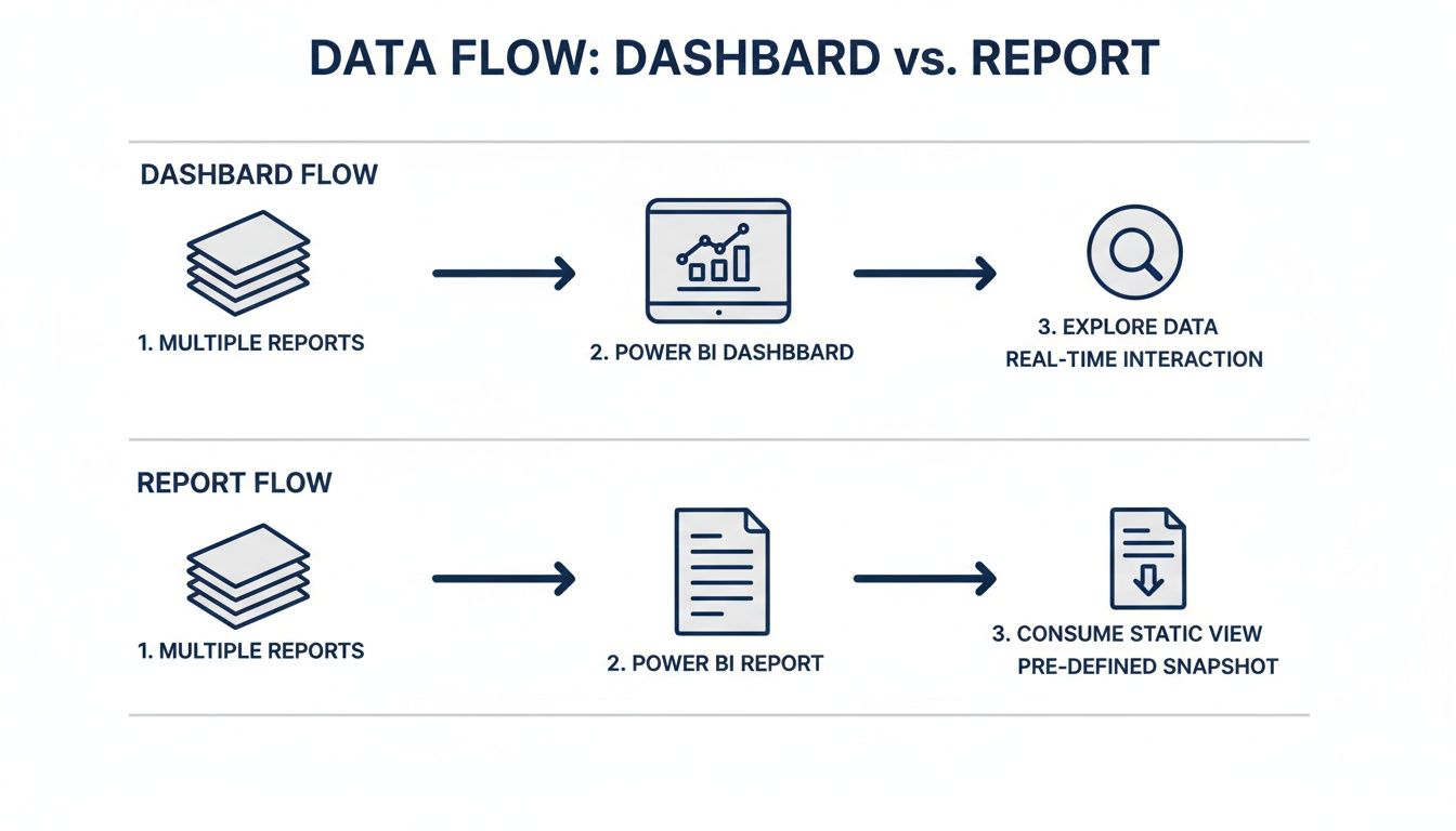
As you can see, the dashboard isn't for deep analysis. It's the high-level command centre, built from the most critical pieces of the underlying reports.
Securely Sharing Your Insights
Getting the right information to the right people is essential. Power BI has robust, built-in security that lets you share dashboards with your team securely. You have complete control over who sees what, ensuring sensitive data remains confidential while empowering your team with the insights they need.
This focus on secure data governance has been a major driver of its adoption in South Africa. After the 2016 Microsoft Business Summit in Johannesburg, Power BI dashboards began making a significant impact. Today, JSE-listed companies run an average of 67 dashboards per firm. Naspers even used them to help achieve a 24% revenue growth YoY.
A 2023 PwC South Africa survey found that 81% of CIOs see Power BI as a priority for dashboard governance, with POPIA compliance pushing 92% to rely on its secure sharing features.
When insights can be shared this securely, your dashboard becomes a central tool for decision-making across the entire organisation.
Designing Dashboards That Drive Action
A Power BI dashboard that doesn’t inspire a decision is just a pretty picture. User-centric design transforms raw data into clear, actionable insights. This isn't about aesthetics; it's about making complex information understandable in seconds.
Effective design starts with choosing the right tool for the job. You wouldn't use a hammer to turn a screw; similarly, using a pie chart to show trends over time creates confusion. The goal is to match the visual to the data's story.
This deliberate approach ensures your audience grasps the key message without deciphering a puzzle. A well-designed dashboard instinctively guides the user's eye, tells a compelling story, and points towards a conclusion or a necessary next step.
Choosing the Right Visuals for Your Data
Picking the correct chart type is the foundation of clear communication. Every visual has a specific job, and getting it wrong can mislead your audience. Your choice should always be driven by the insight you want to convey.
Here are a few fundamental principles:
- For trends over time: Always use a line chart. It’s the clearest way to show performance progression, like monthly sales figures.
- For comparisons: Bar or column charts are best. They make it easy to compare distinct categories, such as sales performance across different product lines.
- For parts of a whole: Use a pie chart or donut chart with caution. They are only effective for showing a few categories that add up to 100%. For more than five categories, a bar chart is a better choice.
- For showing relationships: A scatter plot is perfect for revealing correlations between two variables, like marketing spend versus new customer acquisition.
Layout Strategies That Guide the Eye
How you arrange visuals is as important as the visuals themselves. People naturally read screens from the top-left, moving across and down. Use this to your advantage.
Place your single most important KPI—the one number that defines success—in the top-left corner of your dashboard. This could be total revenue, daily production output, or your customer satisfaction score.
From there, arrange supporting charts in a logical flow, moving from high-level summaries to more granular breakdowns. This creates a natural narrative that makes the experience intuitive. The aim is to build a visual hierarchy that answers the most pressing business questions first.
Getting the design right can directly impact business outcomes. For example, a well-structured dashboard helps analyse customer behaviour patterns and reduce churn rate by making that information timely and visible.
Using Colour with Purpose
Colour should be a tool for communication, not decoration. Too many bright colours create visual noise that distracts from the core message. Use a muted, professional palette for main visuals and reserve a single, bright colour to highlight what matters.
For example, use shades of blue for standard bar charts, but set a rule that turns figures below a critical threshold bright red. This immediately draws the eye to problem areas that require action, turning your dashboard into an early warning system.
For a complete guide, explore our detailed article on Power BI dashboard design.
To help sidestep common design pitfalls, here is a quick reference table outlining best practices.
Dashboard Design Do's and Don'ts
| Do | Don't |
|---|---|
| Keep it simple. Focus on key metrics that drive decisions. | Clutter the screen. Avoid fitting every possible metric onto one page. |
| Use consistent formatting. Ensure fonts, colours, and alignment are uniform. | Use inconsistent scales. This can be misleading when comparing similar charts. |
| Tell a story. Arrange visuals logically to guide the user from overview to detail. | Use confusing charts. Avoid overly complex visuals that require explanation. |
| Label everything clearly. Make sure every chart, axis, and metric is clearly labelled. | Rely on colour alone. Use icons or labels for better accessibility and clarity. |
Ultimately, the goal is a dashboard that is intuitive, compelling, and sparks immediate, informed action.
Real-World Power BI Dashboards for South African SMEs
Theory is useful, but the real value appears when you see Power BI dashboards solving real-world business challenges. Let's look at three practical examples for common South African small and mid-sized enterprises (SMEs).
For any SME, the return on a business intelligence tool is measured by better decisions. A great dashboard answers your most pressing questions and points you toward growth and efficiency.

Sales Dashboard for a Distribution Company
Imagine a national distribution company with sales reps covering all nine provinces. The sales manager needs a high-level view to allocate resources smartly and spot regional trends.
A purpose-built sales dashboard connects their CRM and accounting software, pulling crucial metrics into one place.
- Key Metrics Tracked: Sales revenue vs. targets, performance by rep, top-selling products by region, and the current sales pipeline value.
- Business Decisions Enabled: The manager can instantly see which reps need coaching and which are exceeding targets. They can identify if a product is a bestseller in Gauteng but lagging in the Western Cape, signalling the need for a targeted marketing push. It’s about replacing guesswork with data-backed strategy.
Operations Dashboard for a Manufacturing Firm
Consider a small manufacturing firm based outside Durban. Their business hinges on production efficiency—minimising downtime and ensuring quality. An operations dashboard becomes their command centre for the factory floor.
By connecting to machine sensors and quality control systems, the dashboard provides real-time visibility.
This is where a business shifts from being reactive to proactive. Instead of discovering a production problem at the end of the day, managers can see issues the moment they arise and prevent costly delays.
- Key Metrics Tracked: Machine uptime vs. downtime, production output per hour, quality control failure rates, and raw material inventory levels.
- Business Decisions Enabled: If a machine’s uptime dips, it can be flagged for preventative maintenance before it breaks down. A spike in quality failures can be traced to a specific production run for an immediate fix.
Financial Health Dashboard for a Professional Services Business
A professional services firm, like a law practice or engineering consultancy in Johannesburg, depends on cash flow and project profitability. Their financial data is often scattered across invoicing software, timesheet systems, and bank statements.
A financial health dashboard consolidates this information into a single, coherent picture.
- Key Metrics Tracked: Monthly recurring revenue (MRR), a rolling cash flow forecast, outstanding debtors (accounts receivable), and profitability per project or client.
- Business Decisions Enabled: Partners can see at a glance which clients are late with payments, enabling faster follow-ups. They can also analyse which types of projects are most profitable to focus their business development efforts.
These examples just scratch the surface of what Power BI dashboards can do. For more ideas, browse our collection of Power BI dashboard examples. The impact is already felt across South Africa. A 2024 University of Cape Town study found that major retailers are using dashboards to improve sales forecasting accuracy by 37%. Netcare hospitals have cut patient wait times by 41% using real-time bed occupancy visuals, and Anglo American reported 56% efficiency gains by monitoring operational KPIs. You can explore more about these adoption strategies by reading the full research on BI and analytics adoption.
Scaling Your Analytics for Long-Term Growth
Building your first Power BI dashboard is a great start, but the real value comes from building a mature, company-wide analytics capability. This means planning for growth, keeping data secure, and fostering a culture where data-driven decisions are standard practice.
Scaling analytics ensures your systems can handle growing data volumes and user numbers without slowing down. A dashboard that is fast with six months of data can become sluggish with three years' worth. Planning for this from day one is key to long-term value.
This requires a strategy that considers the technical, procedural, and cultural sides of business intelligence. This is how dashboards evolve from a niche tool for managers into the central nervous system of your entire organisation.
Optimising Dashboard Performance
If a dashboard is slow, people won't use it. In the South African context, where internet speeds can be inconsistent, ensuring your Power BI dashboards are fast and responsive is essential.
Performance comes from getting a few key data engineering processes right.
- Efficient Data Modelling: A clean, well-structured data model is the foundation of a speedy dashboard. This usually means using a 'star schema' design and avoiding complex relationships between tables.
- Smarter Data Refresh: Instead of reloading your entire dataset every time, use incremental refresh. This technique only updates data that has changed, drastically cutting down on refresh times.
- DAX Optimisation: The DAX formulas used for calculations can have a massive impact on performance. Writing clean, efficient DAX code prevents your dashboard from slowing down when users apply filters.
Data Governance and Security
As more people use dashboards, you must control who sees what. Data governance provides the rules and processes to ensure your data is accurate, consistent, and used responsibly—which is crucial for complying with South Africa's POPI Act.
Power BI has powerful security features to manage this effectively.
Row-Level Security (RLS) lets you control data access down to the individual row. With RLS, you can build one sales dashboard where each sales rep sees only their own performance data, while their regional manager sees data for the entire team.
This setup protects sensitive information while giving employees the specific data they need. Good security isn't just about compliance; it builds trust in the entire system.
Building a Data-Driven Culture
The ultimate goal is a culture where data is the starting point for any important business conversation. This means putting dashboards in the hands of people at every level of the organisation. A data-driven culture requires deliberate effort, training, and demonstrating clear value.
This cultural shift truly unlocks your return on investment. In South Africa, Power BI adoption has climbed steadily since 2015. A 2023 survey found that 45% of Johannesburg-based enterprises use it for core reporting. However, only 19% of SMEs in Pretoria have achieved full adoption, often due to a skills gap. On the other hand, Power BI's mobile features have been a huge win, with 65% of South African users accessing dashboards on smartphones during the 2023 loadshedding crises. You can discover more insights about Power BI adoption in South Africa.
To nurture this culture, offer training, celebrate wins that come from data, and ensure every new dashboard solves a real business problem.
Frequently Asked Questions
Here are straight answers to the most common questions we get from South African businesses about Power BI.
How much does Power BI cost for a small business?
For most small to medium-sized businesses, the cost is surprisingly manageable. Microsoft offers several options, but the Power BI Pro license is usually the best fit. It is a predictable per-user, per-month operational cost, not a large upfront investment.
Think of it as an investment in smarter decisions. That small monthly fee can pay for itself the first time it helps you spot a costly mistake or uncover a new sales opportunity. The initial setup and development also require investment, where an expert ensures your dashboards are built on a solid data foundation from day one.
What is the difference between a dashboard and a report?
A Power BI report is like a deep-dive book on a specific subject, with multiple pages, charts, and tables for detailed exploration.
A Power BI dashboard is the single-page executive summary on the front cover.
A dashboard is always just one page. Its job is to provide a quick, at-a-glance overview of your most critical numbers, often pulling key visuals from several reports. You use a dashboard to check the pulse of your business and a report to figure out why a number has changed.
Do I need to be a data scientist to use a dashboard?
Absolutely not. While building a reliable and secure dashboard requires technical skill in areas like data modelling and ETL, using one is designed to be simple.
A well-designed dashboard does the hard work behind the scenes, turning complex data into clean visuals anyone can understand. The goal is to empower everyone on your team—from the CEO to the operations manager—to make decisions based on facts, not guesswork.
How secure is my company data in Power BI?
Data security is non-negotiable, especially for South African businesses needing to comply with the POPI Act. Power BI is a Microsoft product built on an enterprise-grade security platform.
It has multiple layers of security to keep your information safe.
- Row-Level Security (RLS): This feature ensures people only see the data they are authorised to see. A sales rep sees their own numbers, while a manager sees the whole team's.
- Data Encryption: Your data is encrypted both when it is being transferred and when it is stored in the cloud.
- Local Data Centres: Microsoft has data centres in South Africa, helping businesses meet data residency requirements and ensuring data is managed under local laws.
These features provide tight control, so you can share crucial insights across your organisation without compromising on security.
Need help building your next Power BI dashboard or data automation workflow? Contact DataSimplified to discuss how we can turn your business data into powerful insights at https://datasimplified.co.za.
